Bearied Treasure - Post Mortem/Game Design
Bearied Treasure is a game made for GMTKJam 2018, who's theme was "[GENRE] without [MECHANIC]". We attempted to make an action game without a weapon, a metroidvania-like game without power ups, health drops, etc, and a non-violent platformer. The following is a blurb about the game's development (with images) so please consider giving it a read! If you're just interested in playing the game click here!
Technical Stuff
- Game Engine: Gamemaker Studio 2
- Art: Pyxel Edit, Aesprite
- Total Dev Time: At least 23 hours, 52 minutes and 48 seconds
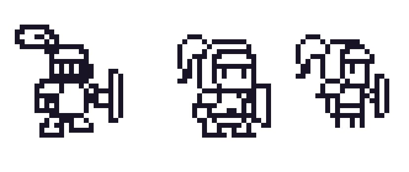
The first pass of our player character!
Theme Interpretation
The theme's interpretation started with making a fighting game without fighting. It evolved into an action platformer about a knight with no sword, just a shield. This evolved into trying to include metroidvania elements without power-ups.
We considered making a visual novel without romance, but scrapped it because it would be too graphics heavy to get done in time.
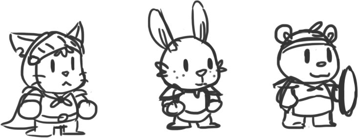
Protagonist designs!
Mechanics
With our idea set, we then went off to the races to come up with mechanics for our hero. We came up with the following:
- Reflecting projectiles
- Block projectiles
- Shield Surfing/Skipping over water
- Push enemies around
- Block attacks
- Stun enemies
- Throw the shield like a boomerang
- Shield parry
Not all of these made it into the final build. We ended up with this short list:
- Block projectiles
- Stun enemies
- Shield parry
- Block attacks
- Push through/past enemies using the shield
- Throw the shield like a boomerang
Mechanics Implementation
With our set of mechanics decided on, we started to work on the game.
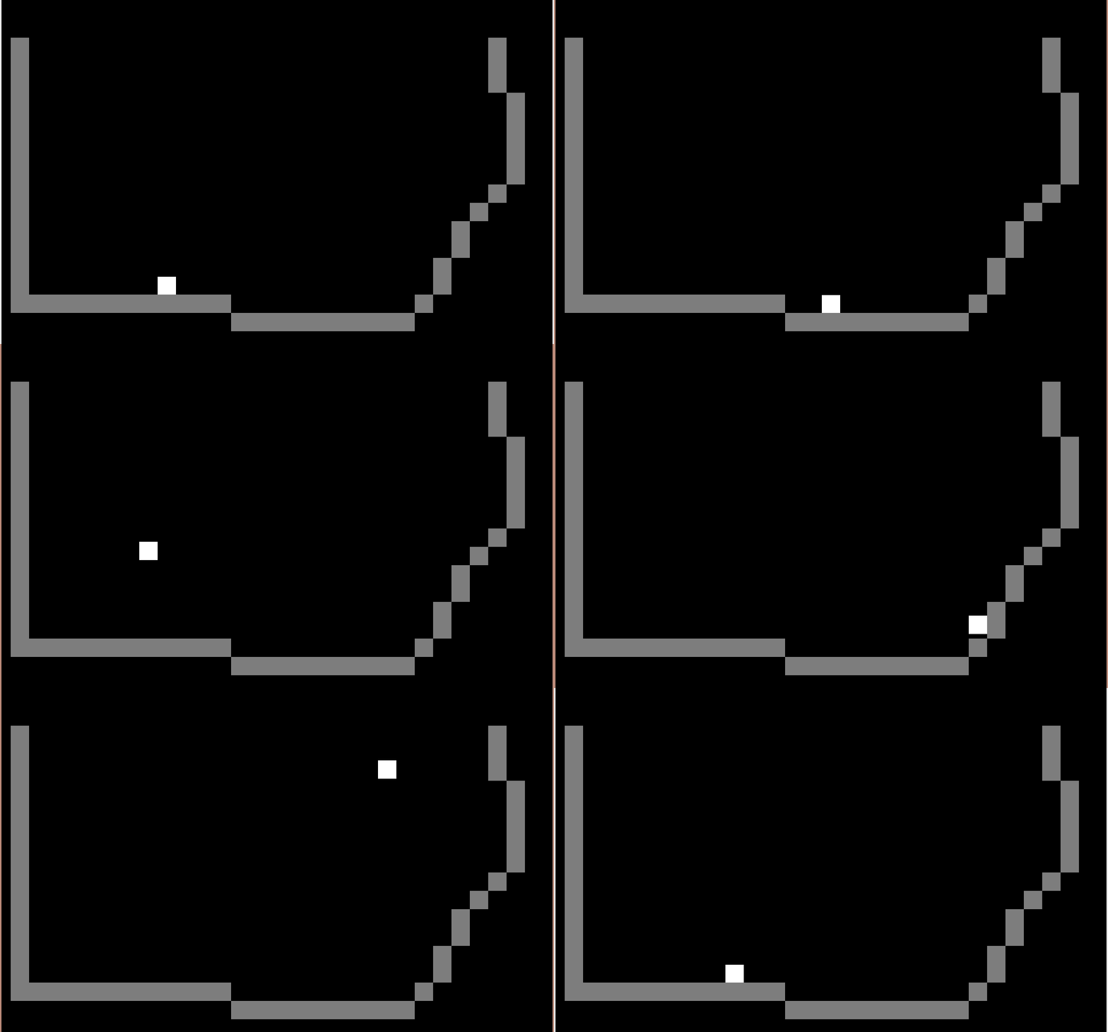
We used the lovely platformer tutorial by Shaun Spalding as our base. Programming-wise, we had never made a platformer before. It wasn't too hard to get setup. We then started to implement everything else~
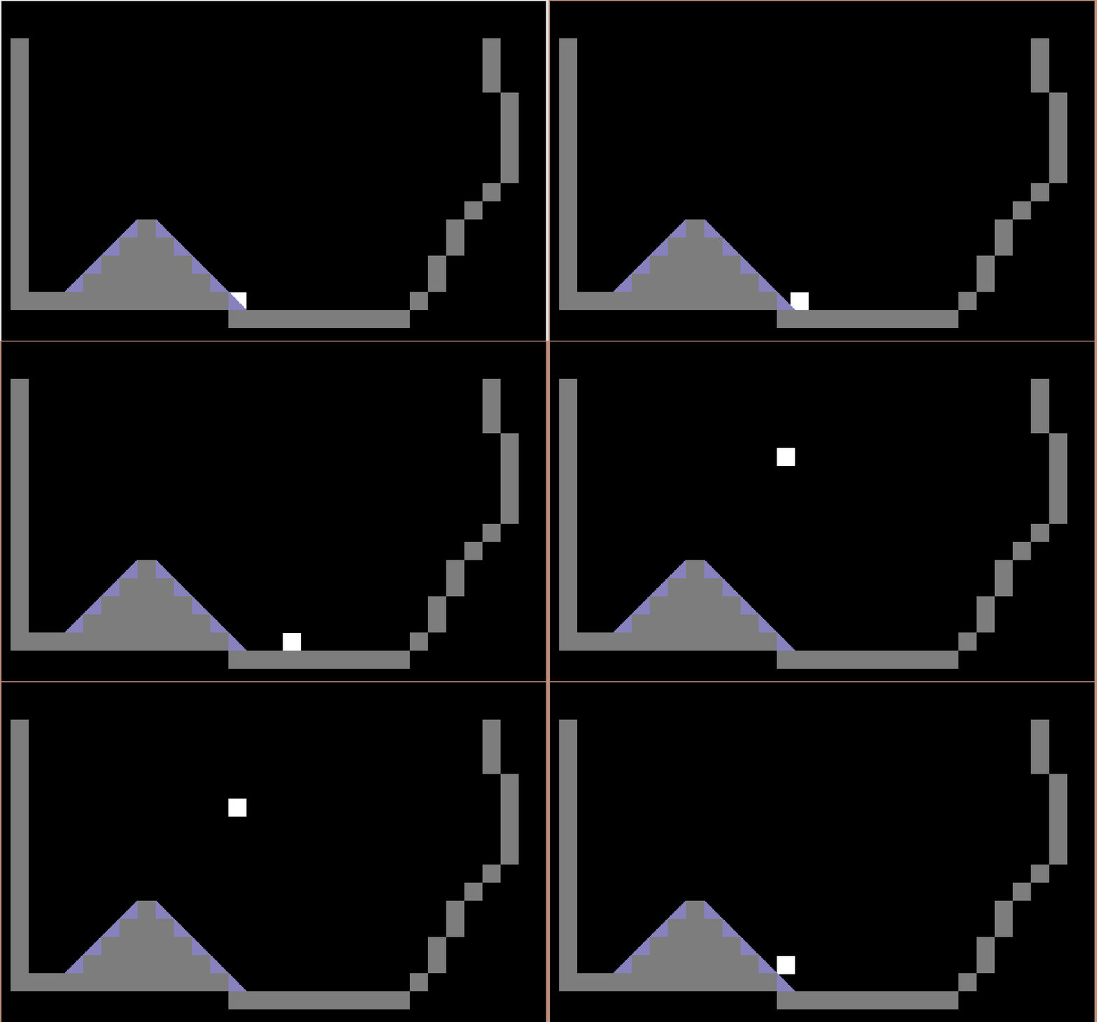
We then went to try to get slopes working. We uh- had a few issues with the slopes on our first pass.
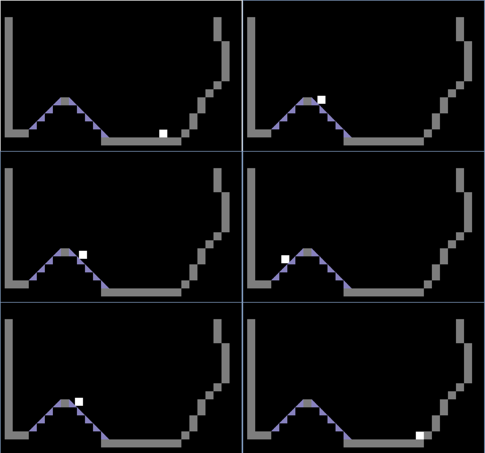
A couple of minor corrections later and we got some slopes. Since we removed the idea of "using the shield to skip over water/shield surfing" we didn't bother with having the character stick to the slopes while moving down them. The water idea with the shield was to "gain momentum while sliding down slopes to send yourself flying and then skip across".
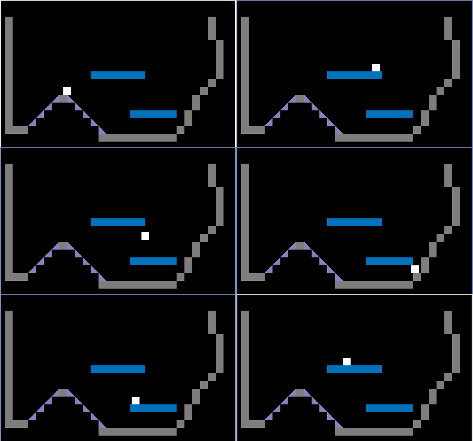
Platforms were very easy to implement. Fundamentally they are just a floor that you can jump up through, but not fall through. If moving up, go. If moving down, stop.
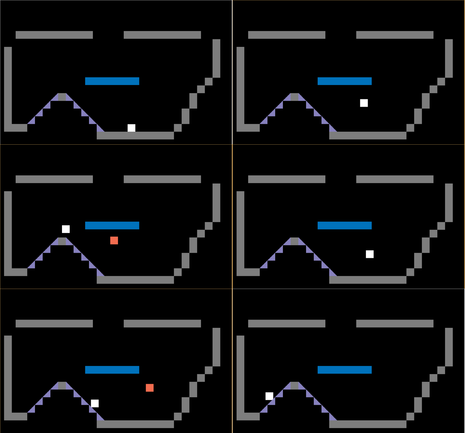
This was the first pass of the shield throw mechanic. We had the shield go out in front of you and then speed up as it tried to return to you. In our initial draft we allowed the player to move around while the shield would follow you back. We ultimately limited it to the ability to jump and throw the shield at the same time.
When throwing the shield, you are throwing away your defenses. Your shield becomes able to switch switches, stun enemies, etc. Although it would be really cool to have the player throw away their shield and use it's Captain America/Thor's Hammer homing abilities to stun enemies, flip switches, etc as it followed you, it was unlikely most people would use it in such a way. More likely than not, the game would become extremely difficult the moment you tried to move away with your shield gone and you would die a lot. There was also the possibility to flip switches and stun enemies that you did not want to. Also it would require more art to account for the states where you did not have your shield. So we limited it.
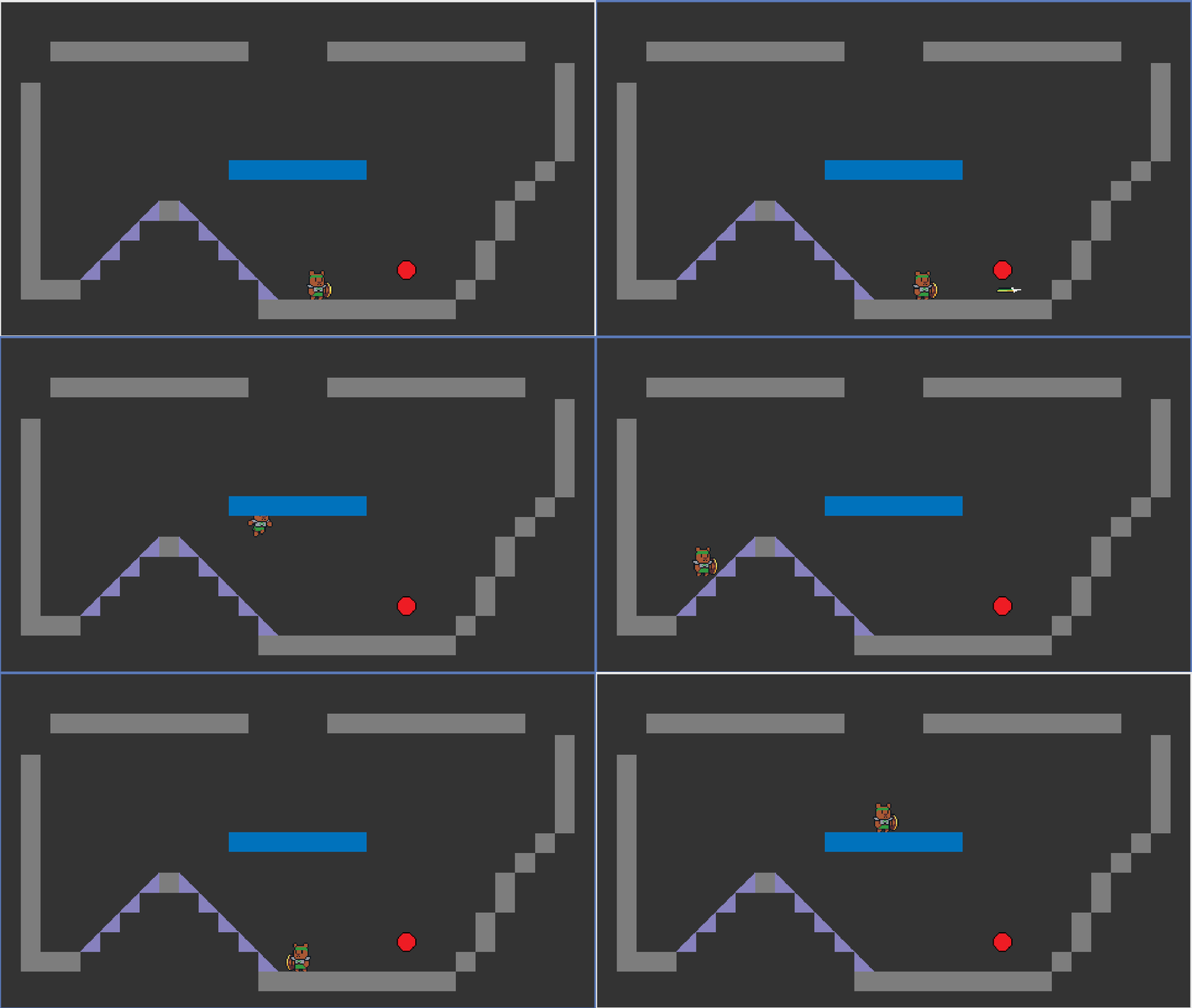
Our first graphics~! We also added a direction for the bear to face and flipped the images when the bear faced a different direction.
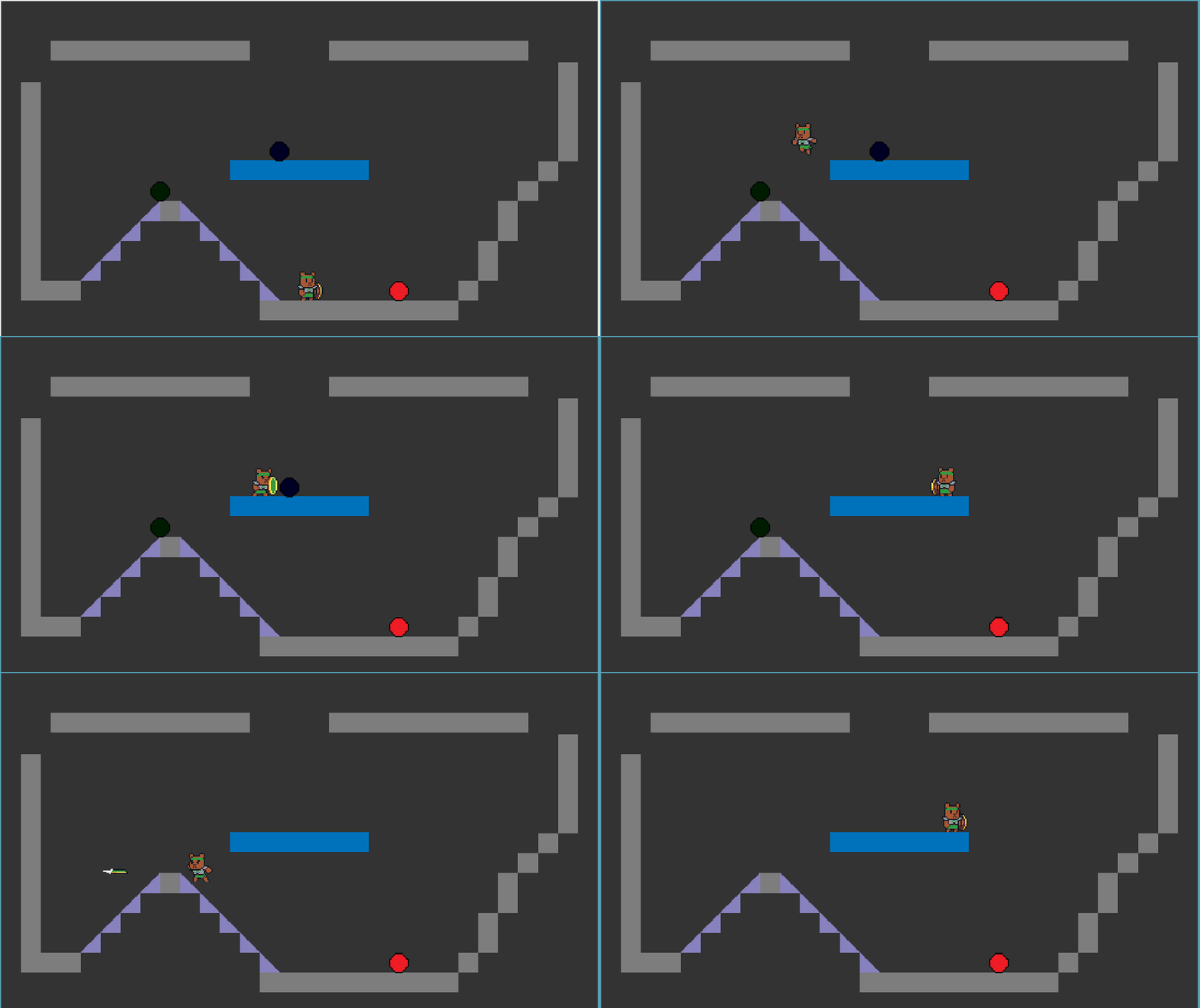
Our first pass of enemies without there being art.
The blue circle was to be "enemies that you could push through". We wanted to have enemies that you could push, maybe onto switches or into water or down pits of doom. We didn't have enough time to implement this, so in the final version you "push pass them to stun them". Also they ended up being the spear bears.
The green circle was to be "enemies that you could stun with your shield thrown". It didn't really change much in the final version, but they ended up being the deer archers. It seemed fitting to use a ranged skill to deal with a ranged enemy.
This was the last bit of mechanics work we got done around mid-Saturday or about 1/3 - 1/2 of the way through the jam.
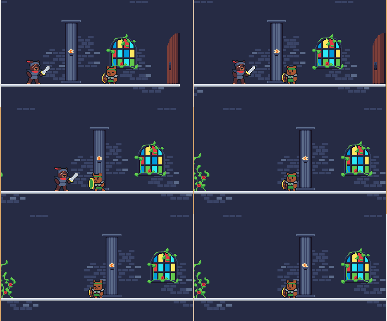
A couple hours later we had art \o/ And we could finally start to work on the parry mechanic. This was around 20 hours left in the jam.
The parry mechanic was the last one to get in because the "stun" had to happen when the shield was up in a certain group of animation frames for the enemy. To be precise, right when their sword would swing down. At first we wanted to have the parry only work if before the swing the shield was not up, and during the swing it was. This was scrapped because of time constraints and it would be too difficult for players to figure out. Also, we would need to teach this somehow, and we did not have the time to figure that out. Likely we would use a parry indicator, but then that might be too much hand holding. Ultimately, if you shield is up when he swings and your shield still has some strength then you'll parry.
You will also noticed we zoomed in the camera. This was to focus on the player more.

And here is our archer in action. There was a fair amount of work put into those arrows to make sure their heads followed the arc that the arrow was going in. So if an archer is firing at you from above, the arrow head will point down at you. We also had to use physics to calculate the speed at which it had to travel horizontally in order to hit the player. If you look very closely you'll notice that the arrow spawns above the deer archer. This is on purpose. In order to have the horizontal speed not be double (and therefore ridiculously fast) it had to be placed higher up.
We also added the "blocking projectiles" mechanic here.
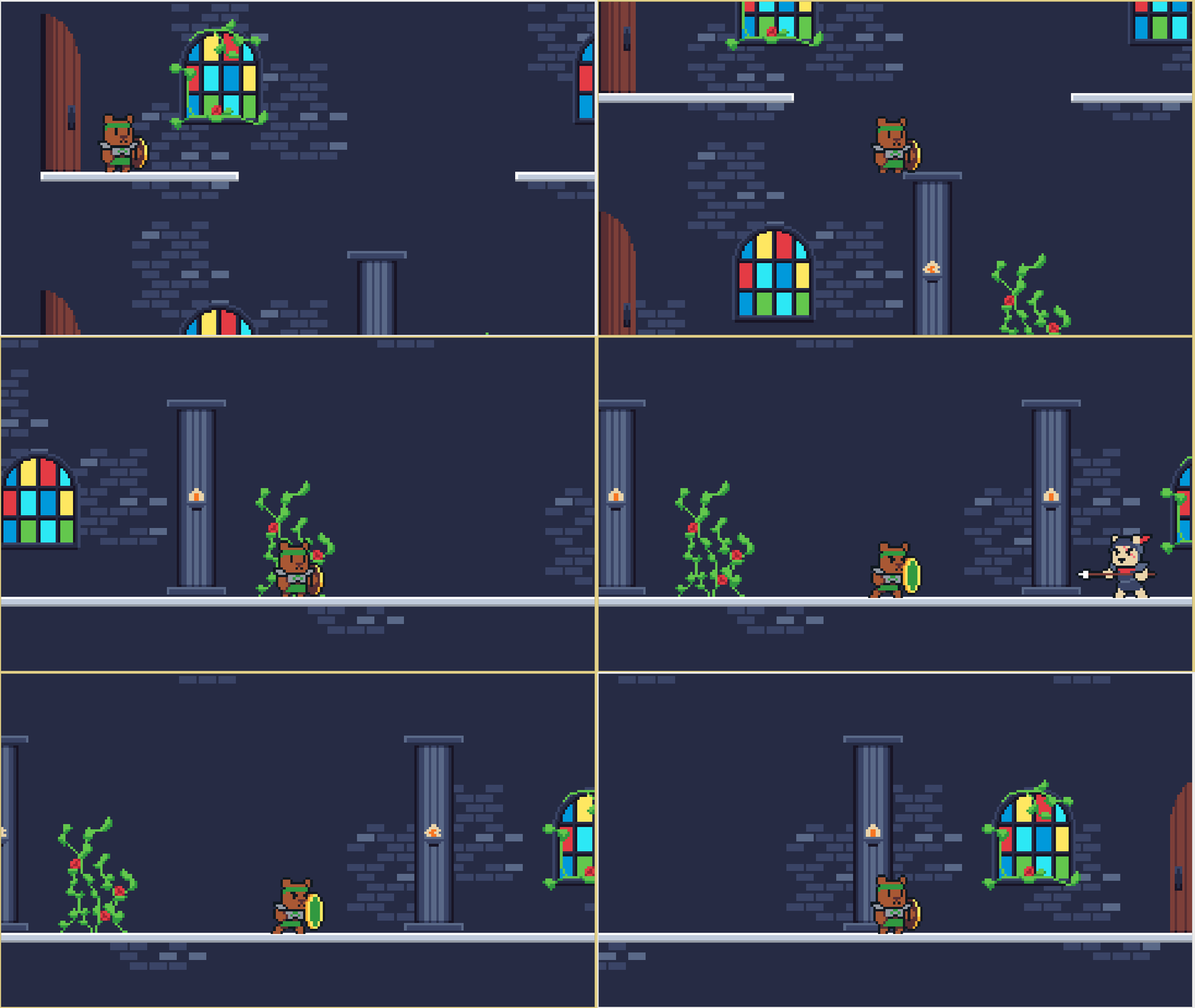
Push past your fears and you will succeed.
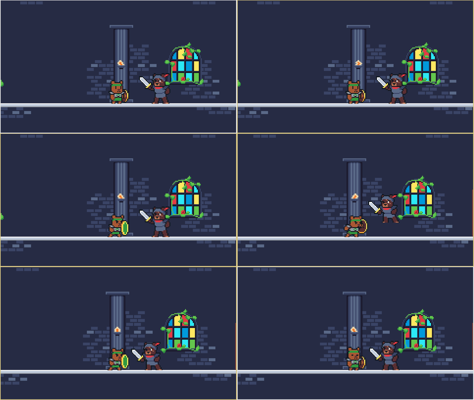
This was the first full realization of the stun mechanic. Before the enemy would just vanish/be destroyed when you stunned them. At first we wanted to allow enemies to become "unstunned" after a set period of time while you were still in the room but had to scrap it because it would become too difficult, and we were running out of time! There were 17 hours left! And it was midnight. So bed time.
One note though: if we were to not have this "stunned" mechanic, the enemies would've been permanently removed from the maps/killed after you had defeated them. So when you went back to previous rooms maybe their bodies would've been there. Or maybe not. That's rather morbid.
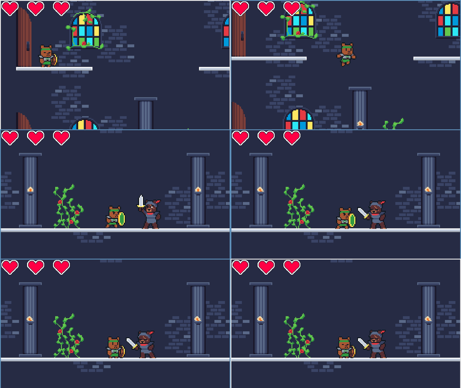
Dawn of the final day. 10 hours left. Here's how our health bar looked at first.
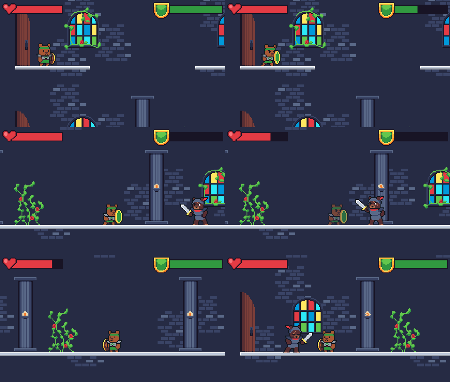
We ultimately changed it to this sort of thing.
The game was not going to have pickups or health drops or power-ups. Which means as a player what you were given was what you got.
We added a shield stamina bar because as long as your shield was up you were invincible. You could not be hurt, and you could go through the whole dungeon with it up. It wouldn't be much of a challenge. But there were no pickups. So we had stamina that would recharge over time. If your stamina was gone and your shield was up, you could be hurt. Also each time you threw away your shield not only did it make you vulnerable but also used up stamina. So it was entirely possible you could throw the shield away and then have 0 stamina when it came back.
We also changed the health bar to be similar. It has a much longer recharge time though. With three (or a set number of) hearts we found it too difficult to advance. In simpler rooms with one or maybe two enemies you could get through without a problem, but if we wanted more than that three hits would be gone SUPER fast. So the game would be too frustrating and difficult.
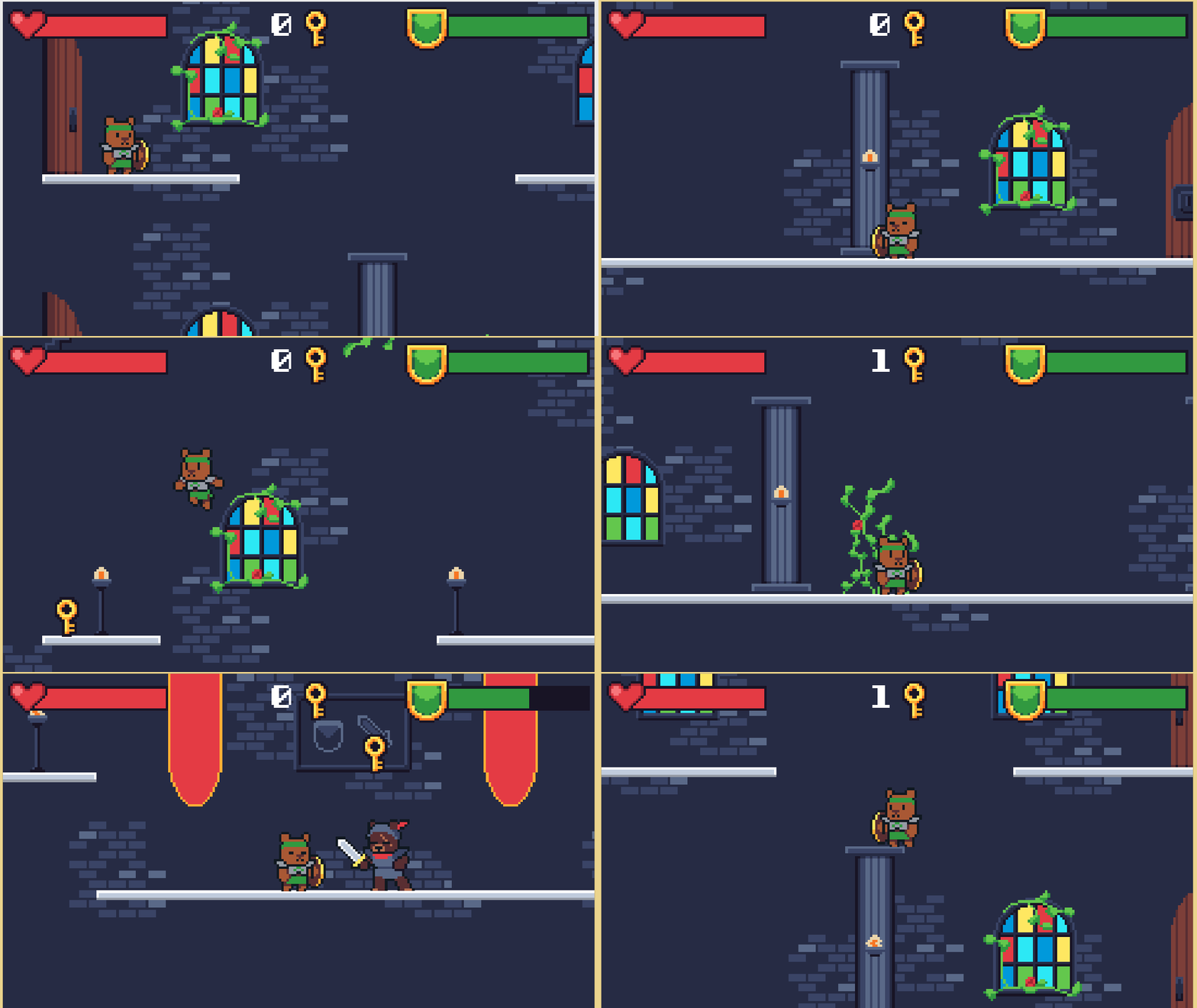
This was the last mechanic we added, and from the feedback we've gotten the most contentious.
The keys were created as a way to make sure that the player would do the tutorial. We'll go into it a bit later, but we locked the doors needed to progress to teach:
- How far you could jump
- How to defeat enemies by blocking
- How to defeat enemies by throwing the shield
- That you could jump on top of columns
Thinking back on it now, we probably should've allowed players to just skip ahead, but considering the way to advance past the tutorial was to jump, there was a concern that players wouldn't know how the shield controls worked. Since the tutorial is extremely short and to the point, we figured it wouldn't be that big of a deal. Besides, we could also teach that defeating enemies could help you progress (this was ultimately scrapped pass this point more on this later).
At this point we had 6 hours left. And.... 4 rooms....
Level Design
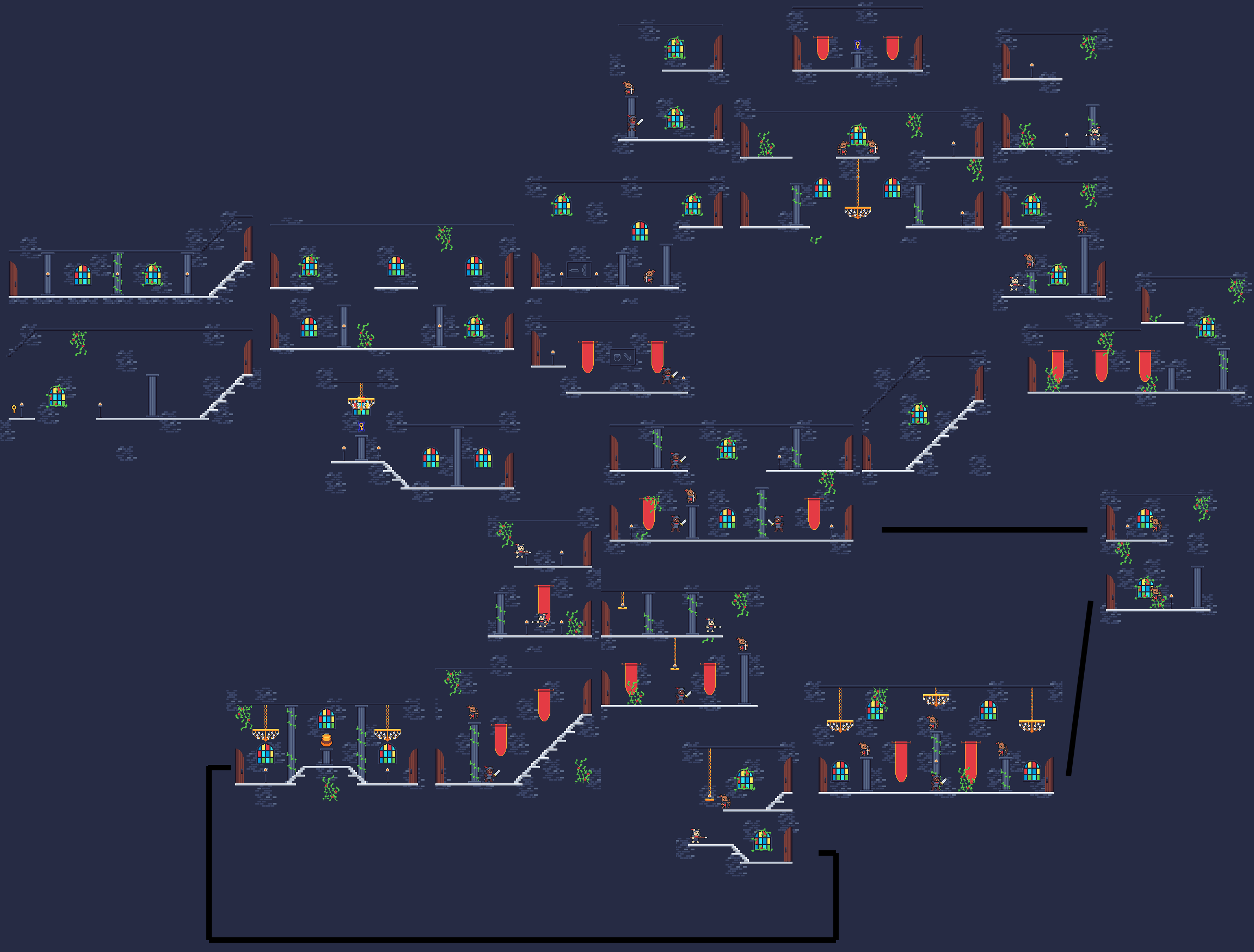
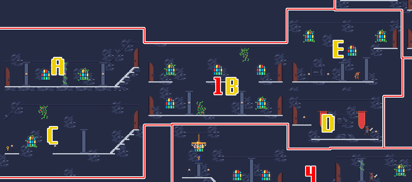
Here is all 21 rooms spliced together. All of the enemy locations, keys, etc are all here showing their spawn locations. Spoilers.
I would like to talk about each room in particular but this is already a very long blog post so I'll instead group them up as follows:
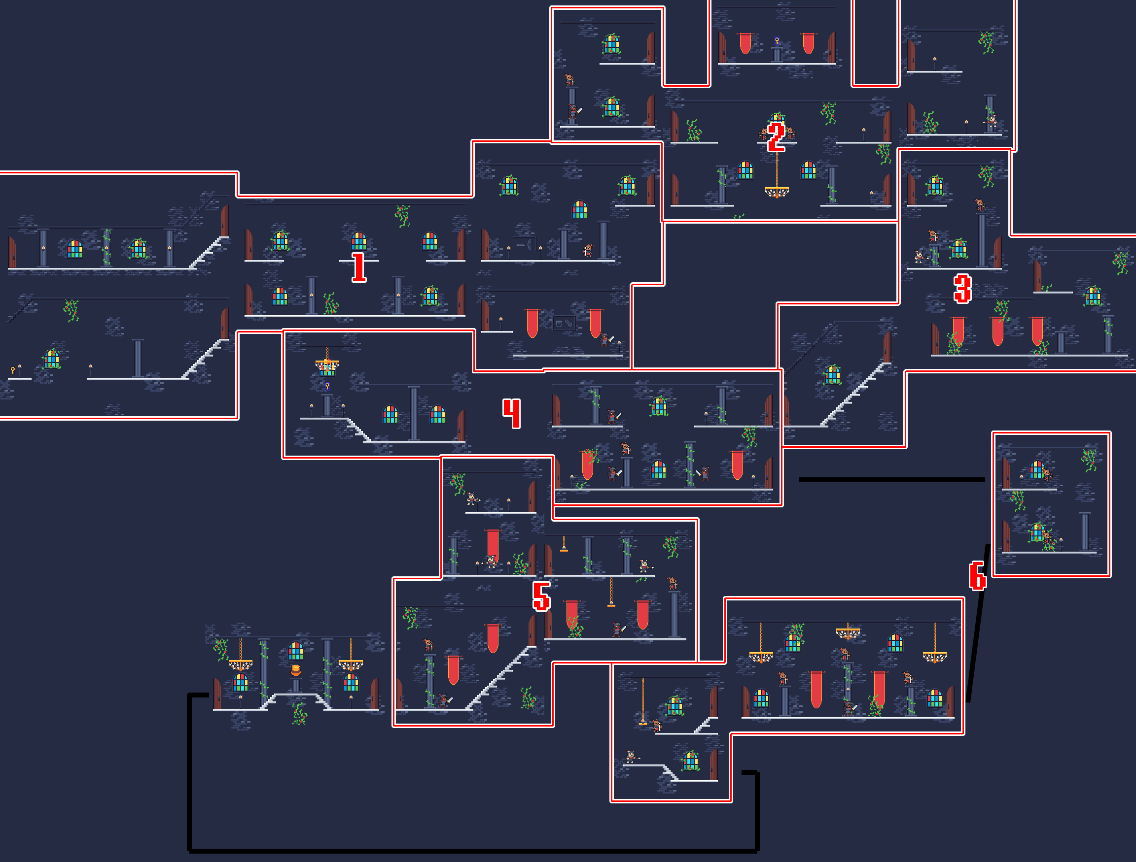
BTW, yes we were using tiles for this, but each room was hand made. #Suffering.
The Tutorial
I mentioned it earlier, but there was a tutorial section to the game.
1A
We start here. We're shown what the controls are. Then you move. It sets the stage for the game, lets you get an idea of how fast you move left/right and if you so choose you can jump around. Also you travel between rooms via doors.
1B
This room is the first (of what would become many) rooms where you learn you can take different routes... kinda. It's intended to teach you jumping, and that you can jump on top of pillars. Also there are locked doors. To advance, you need to go to C. To progress through the dungeon, you need to be able to get into E, which ensures you learn about pillars.
1C
You can jump far. There are also things out of sight. Tread carefully.
1D
You can actually skip this room entirely. This room is to teach the shield blocking. When you stun the bear they'll drop a key. We chose the "stun to drop" idea to ensure people actually learned. There's a small ledge/drop to make sure the enemy doesn't attack you right when you enter. Also a mural showing the block/shield and the sword.
1E
Teaches about throwing your shield. Also because of the placement of the enemy, you can see it when you enter the room but it doesn't attack you right away. Another mural showing what to do. To proceed past the tutorial you needed to not only jump on the pillars (to reinforce), but also you needed to "stun to drop".
Early on we thought about having a switch in this room you would need to flick, but then it wouldn't ensure that you learned about stunning enemies with your shield. We also removed it because of time constraints for getting the switch/barricade art in. In the first draft you would return to the center room to find a new door. This didn't really work because we decided to have doors on the left/right of the rooms. We would've needed new controls for interacting with doors and new art for a front facing door.
Branching
This was when the panic began. We had a tutorial, but goal? Rest of game? Metroidvania... anything? AAA
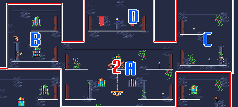
2A
The center room. At this point we still thought about having the ability to traverse through the dungeon by falling. So there was a chandler you could cross. Maybe a secret if you fell you found something. Obviously, that was scrapped. With the two enemies above, the player would try to jump across to find a locked door. Then there were two doors available.
2B
This was the harder room of the two. The idea was that maybe players would try to explore a bit and realize there could be more than one route to the goal, and that there was an easy and hard way to get there.
2C
The easy way, and the introduction of the pike. We didn't have enough time to show a tutorial for this guy, and up until the last hour we considered removing him entirely.
Take a Breather... In a Sec
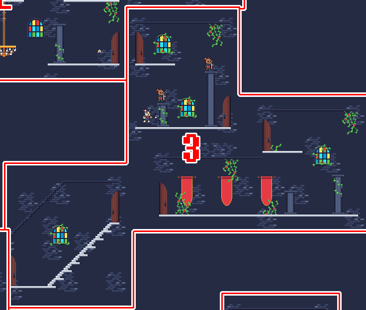
After getting the key, you would enter into a room with a lot of enemies. But also, none of them could hit you by the door. However you could see the archer's attacks. This room was meant to say "hey it's about to get hard". And the next two rooms were "here take a breather and recover". The calm before the storm.
Boss Key?
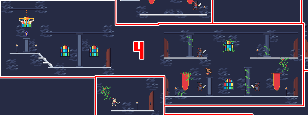
This little section requires a small mention. When you enter into this area the room is SUPER tough if you don't zoom through it. There's three doors to choose from. The easiest route is to either hop across, or drop down to the room below you, dodging the archer. But if you didn't hop across to the room on the other side, you would miss the key to the goal. These rooms were added with less than 4 hours remaining in the jam (last hour for upload!) and so it was decided that this would be the back tracking spot. If you dropped down through any of the two doors below you would have to climb all the way back up to find the key.
Also as a note, in the third section, there is one pillar that is too high to jump onto from below. This is to ensure the player doesn't go all the way back through the castle to find the key. It's sort of limited to 4/5/6.
Go Left
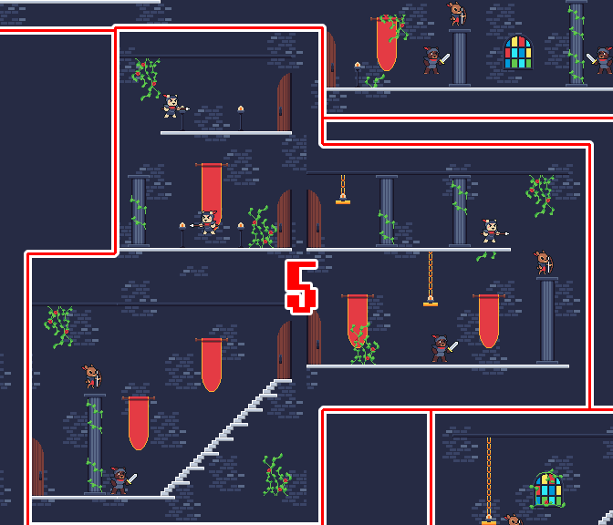
Believe it or not, but this was actually the easier of the routes. It's sort of a trick in the 4th area that the easiest route is behind the hard enemies.
Go Right
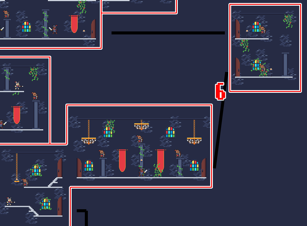
The hard route. Not much more to say than that. There was going to be a 4th room on this route to reinforce that, but it was scrapped because we had 2 hours remaining!!!! We did enjoy designing that middle room though.
And that's all folks!
In summary, we got a heck of a lot done within 48 hours.
We unfortunately had to scrap a lot of stuff that would've made the game feel more like a metroidvania due to time constraints. We wanted to have more branching paths, switches to flip instead of keys, secret areas, and so on. 72 hours instead of 48 would've been great! Plus we could've gotten some time to add SFX and wall images :)
All that being said though, we hope you enjoyed this post and the insights into the game! And of course, we hope you enjoyed playing the game! If you haven't as of yet, please check it out here!
Get Bearied Treasure
Bearied Treasure
An action game without a weapon & No-power-up metroidvania
| Status | Released |
| Authors | Atemly Games, Lilchee |
| Genre | Action, Adventure, Platformer |
| Tags | 2D, Action-Adventure, Cute, GameMaker, Game Maker's Toolkit Jam, Pixel Art, Singleplayer |
| Languages | English |
Leave a comment
Log in with itch.io to leave a comment.